Event-based local app · Austin, TX
Austin's Personalized
Event Recommender
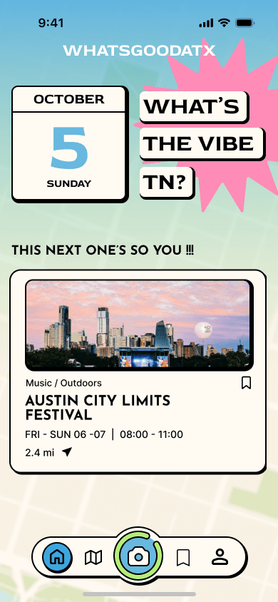
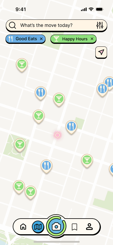
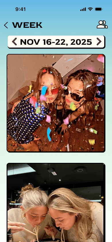
WhatsGoodATX is a social exploration app designed to help people discover events, food, and experiences in Austin. This redesign focused on reducing cognitive overload and making city exploration feel more motivating, accessible, and human.
The app already had a strong audience — over 3,000 users subscribed to their newsletter and Instagram — but the existing experience didn't reflect that strength.
Figma · Mobile UI Design · User Research · Cross-functional collaboration · Adobe Creative Suite
Process — 01
Research & Planning
We began by auditing the existing app to identify usability issues. Initial findings showed:
- Overstimulating color usage
- Confusing navigation and unclear hierarchy
- Disconnected features — maps, events, and discovery felt siloed
- A lack of emotional motivation to explore
WGATX original app screens


Design Critique — Home
- Muddy colors → logo doesn't stand out
- Unappealing blue → lacks contrast and interest
- No typography hierarchy → hard to know what to focus on
- Unclear buttons, no contrast
- Dense text, hard to read
Design Critique — Map
- Cluttered icons
- Slow and uncentered navigation
- Indistinguishable icons
- Colors merge together
- Separate tabs for good eats and happy hours
- No way to search on map
Process — 02
Ideation & Low Fidelity
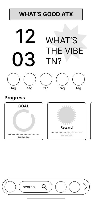
Based on research insights, we focused on restructuring the app around clear task delegation and emotional intent. I led the redesign of core screens, prioritizing simplicity, familiarity, and motivation. Wireframes and prototypes were iterated collaboratively with the team and refined through feedback loops.
The lack of uniqueness and user retention led to the idea of a Neo-Brutalism style and a gamified progress tracker based on pictures and shared memories.
- Increase engagement — encourage users to check in on the app using gamified techniques.
- Redesign the branding — create a more fun, visually appealing product.
- Incorporate a shared tracker — with pictures of events and occasions found through the app.
Low fidelity mockups


Process — 03
New Feature Problem
The client wanted a feature to set her app apart from similar event-finding apps. She proposed a memento mori calendar — showing how many weeks of life are over and how many remain.
The problem
- Fear > Excitement — uses fear to motivate, not joy
- Visual clutter — complicated and hard to comprehend
- Uninteresting — lacks visuals, engagement, and moving parts
The solution
- Camera — take pictures of activities, log them under events
- Memory Roll — weekly calendar of fun memories made
- Friends — share memories with friends on the app
Rather than showing life slipping away, we reframed the feature as a positive motivational calendar — using memories and pictures to represent life well lived, not life lost.
The solution


Process — 04
Development & High Fidelity
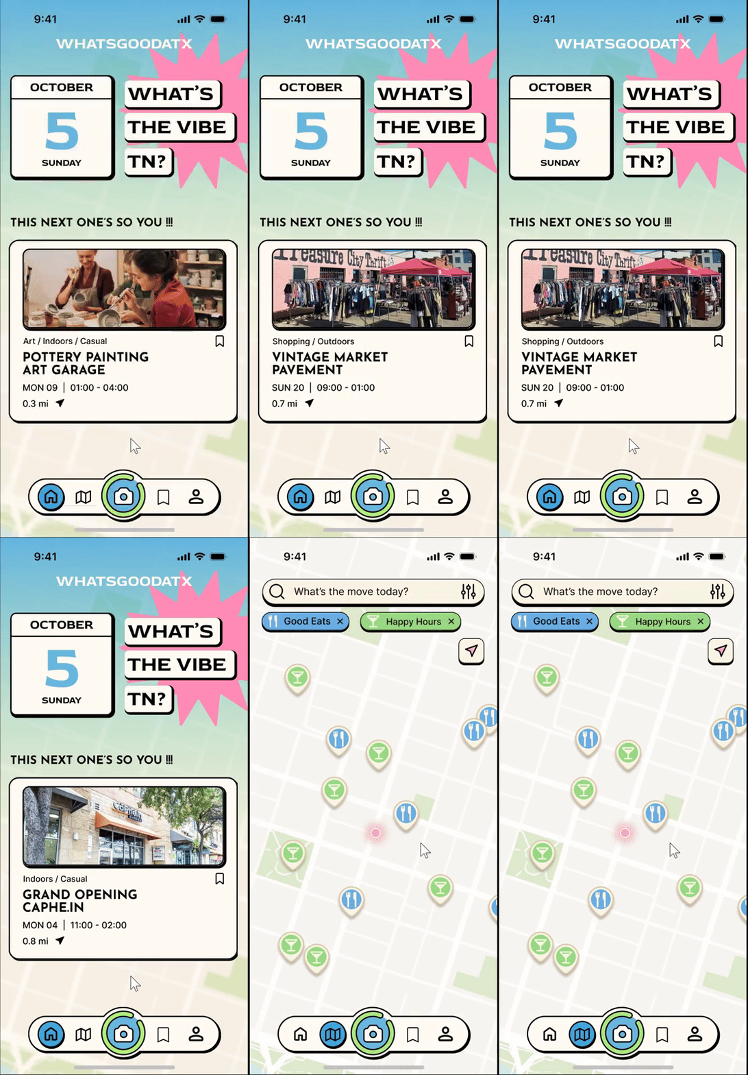
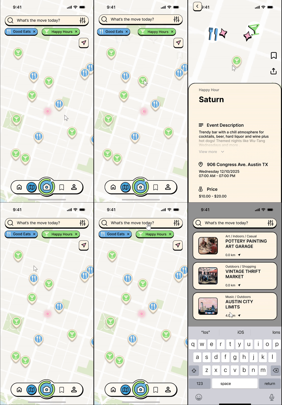
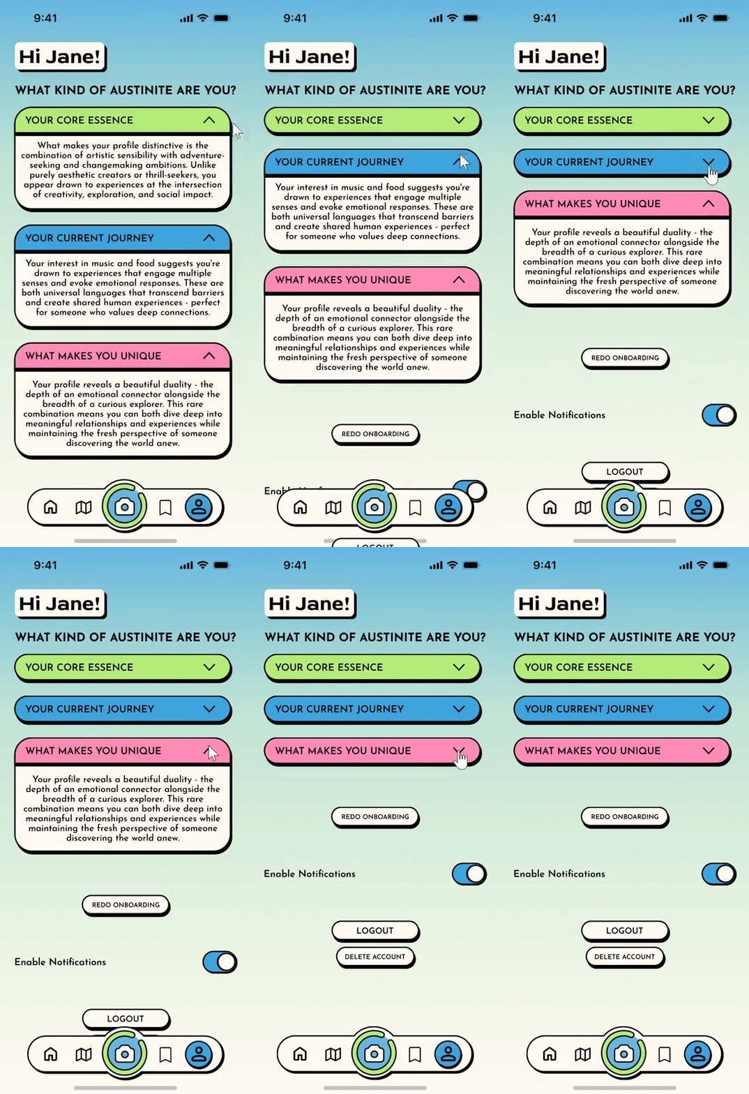
The high-fidelity phase translated research insights into a cleaner, more intentional interface. The visual system was refined by reducing visual noise, clarifying hierarchy, and using color more purposefully.
- →Simplify home screen — Remove unnecessary progress trackers and tags
- →Map background — Overlay home screen that can be swiped up to reveal the map
- →Reskin profile feature — Refreshed to match the new visual system
High fidelity mockups

Outcome
Results
How might we design a connection between the feeling of being left out of life and the desire to explore the city?
We repositioned the app as a motivational exploration tool — not just a directory. The design responds to a genuine emotional need: the fear of missing out on your own city, your own life.
The memento mori concept was transformed into something joyful: a memory-first experience that encourages users to go out, document, and look back with pride — not anxiety.
Final hi-fi prototype screens

Event-based local app · Austin, TX
Austin's Personalized
Event Recommender
WhatsGoodATX is a social exploration app designed to help people discover events, food, and experiences in Austin. This redesign focused on reducing cognitive overload and making city exploration feel more motivating, accessible, and human.
The app already had a strong audience — over 3,000 users subscribed to their newsletter and Instagram — but the existing experience didn't reflect that strength.
Figma · Mobile UI Design · User Research · Cross-functional collaboration · Adobe Creative Suite
Process — 01
Research & Planning
We began by auditing the existing app to identify usability issues. Initial findings showed:
- Overstimulating color usage
- Confusing navigation and unclear hierarchy
- Disconnected features — maps, events, and discovery felt siloed
- A lack of emotional motivation to explore
WGATX original app screens
Design Critique — Home
- Muddy colors → logo doesn't stand out
- Unappealing blue → lacks contrast and interest
- No typography hierarchy → hard to know what to focus on
- Unclear buttons, no contrast
- Dense text, hard to read
Design Critique — Map
- Cluttered icons
- Slow and uncentered navigation
- Indistinguishable icons
- Colors merge together
- Separate tabs for good eats and happy hours
- No way to search on map
Process — 02
Ideation & Low Fidelity
Based on research insights, we focused on restructuring the app around clear task delegation and emotional intent. I led the redesign of core screens, prioritizing simplicity, familiarity, and motivation. Wireframes and prototypes were iterated collaboratively with the team and refined through feedback loops.
The lack of uniqueness and user retention led to the idea of a Neo-Brutalism style and a gamified progress tracker based on pictures and shared memories.
- Increase engagement — encourage users to check in on the app using gamified techniques.
- Redesign the branding — create a more fun, visually appealing product.
- Incorporate a shared tracker — with pictures of events and occasions found through the app.
Low fidelity mockups
Process — 03
New Feature Problem
The client wanted a feature to set her app apart from similar event-finding apps. She proposed a memento mori calendar — showing how many weeks of life are over and how many remain.
The problem
- Fear > Excitement — uses fear to motivate, not joy
- Visual clutter — complicated and hard to comprehend
- Uninteresting — lacks visuals, engagement, and moving parts
The solution
- Camera — take pictures of activities, log them under events
- Memory Roll — weekly calendar of fun memories made
- Friends — share memories with friends on the app
Rather than showing life slipping away, we reframed the feature as a positive motivational calendar — using memories and pictures to represent life well lived, not life lost.
The solution
Process — 04
Development & High Fidelity
The high-fidelity phase translated research insights into a cleaner, more intentional interface. The visual system was refined by reducing visual noise, clarifying hierarchy, and using color more purposefully.
- →Simplify home screen — Remove unnecessary progress trackers and tags
- →Map background — Overlay home screen that can be swiped up to reveal the map
- →Reskin profile feature — Refreshed to match the new visual system
High fidelity mockups
Outcome
Results
How might we design a connection between the feeling of being left out of life and the desire to explore the city?
We repositioned the app as a motivational exploration tool — not just a directory. The design responds to a genuine emotional need: the fear of missing out on your own city, your own life.
The memento mori concept was transformed into something joyful: a memory-first experience that encourages users to go out, document, and look back with pride — not anxiety.
Final hi-fi prototype screens
Event-based local app · Austin, TX
Austin's Personalized
Event Recommender
WhatsGoodATX is a social exploration app designed to help people discover events, food, and experiences in Austin. This redesign focused on reducing cognitive overload and making city exploration feel more motivating, accessible, and human.
The app already had a strong audience — over 3,000 users subscribed to their newsletter and Instagram — but the existing experience didn't reflect that strength.
Figma · Mobile UI Design · User Research · Cross-functional collaboration · Adobe Creative Suite
Process — 01
Research & Planning
We began by auditing the existing app to identify usability issues. Initial findings showed:
- Overstimulating color usage
- Confusing navigation and unclear hierarchy
- Disconnected features — maps, events, and discovery felt siloed
- A lack of emotional motivation to explore
WGATX original app screens
Design Critique — Home
- Muddy colors → logo doesn't stand out
- Unappealing blue → lacks contrast and interest
- No typography hierarchy → hard to know what to focus on
- Unclear buttons, no contrast
- Dense text, hard to read
Design Critique — Map
- Cluttered icons
- Slow and uncentered navigation
- Indistinguishable icons
- Colors merge together
- Separate tabs for good eats and happy hours
- No way to search on map
Process — 02
Ideation & Low Fidelity
Based on research insights, we focused on restructuring the app around clear task delegation and emotional intent. I led the redesign of core screens, prioritizing simplicity, familiarity, and motivation. Wireframes and prototypes were iterated collaboratively with the team and refined through feedback loops.
The lack of uniqueness and user retention led to the idea of a Neo-Brutalism style and a gamified progress tracker based on pictures and shared memories.
- Increase engagement — encourage users to check in on the app using gamified techniques.
- Redesign the branding — create a more fun, visually appealing product.
- Incorporate a shared tracker — with pictures of events and occasions found through the app.
Low fidelity mockups
Process — 03
New Feature Problem
The client wanted a feature to set her app apart from similar event-finding apps. She proposed a memento mori calendar — showing how many weeks of life are over and how many remain.
The problem
- Fear > Excitement — uses fear to motivate, not joy
- Visual clutter — complicated and hard to comprehend
- Uninteresting — lacks visuals, engagement, and moving parts
The solution
- Camera — take pictures of activities, log them under events
- Memory Roll — weekly calendar of fun memories made
- Friends — share memories with friends on the app
Rather than showing life slipping away, we reframed the feature as a positive motivational calendar — using memories and pictures to represent life well lived, not life lost.
The solution
Process — 04
Development & High Fidelity
The high-fidelity phase translated research insights into a cleaner, more intentional interface. The visual system was refined by reducing visual noise, clarifying hierarchy, and using color more purposefully.
- →Simplify home screen — Remove unnecessary progress trackers and tags
- →Map background — Overlay home screen that can be swiped up to reveal the map
- →Reskin profile feature — Refreshed to match the new visual system
High fidelity mockups
Outcome
Results
How might we design a connection between the feeling of being left out of life and the desire to explore the city?
We repositioned the app as a motivational exploration tool — not just a directory. The design responds to a genuine emotional need: the fear of missing out on your own city, your own life.
The memento mori concept was transformed into something joyful: a memory-first experience that encourages users to go out, document, and look back with pride — not anxiety.
Final hi-fi prototype screens